Recently on X, I saw an Andrews plot and decided to plot it in LaTeX.
MATLABもStatistics and Machine Learning Toolboxも持っていないので、私はLaTeXで Fisher Iris Dataset の Andrews plot を描いています
https://t.co/eKnGAvWpLL pic.twitter.com/1tXy5BxrfK
— LaTeX.org (@TeXgallery) May 7, 2026
I took the data file iris.csv from GitHub, and this is my code:
\documentclass[border=10pt]{standalone}
\usepackage{pgfplots}
\usepackage{pgfplotstable}
\pgfplotsset{compat=1.18}
\pgfplotstableread[col sep=comma]{iris.csv}\irisdata
\newcommand{\AndrewsCurves}[4]{%
\foreach \i in {#1,...,#2} {
  \foreach \col/\macro in {
    sepal_length/\sl, sepal_width/\sw,
    petal_length/\pl, petal_width/\pw }{
    \pgfplotstablegetelem{\i}{\col}\of\irisdata
    \expandafter\xdef\macro{\pgfplotsretval}}
  \addplot+[no marks, #3, opacity=0.35]
    {\sl/sqrt(2) + \sw*sin(deg(x))
     + \pl*cos(deg(x)) + \pw*sin(deg(2*x))};}
  \addlegendentry{#4}}
\begin{document}
\begin{tikzpicture}
  \begin{axis}[
    width       = 14cm,
    height      = 8cm,
    domain      = -pi:pi,
    samples     = 100,
    xlabel      = {$t$},
    ylabel      = {$f(t)$},
    xtick={-pi,-pi/2,0,pi/2,pi},
    xticklabels = {$-\pi$,$-\pi/2$,$0$,$\pi/2$,$\pi$},
    grid        = both,
    legend pos  = outer north east]
    \AndrewsCurves{0}{49}{blue}{setosa}
    \AndrewsCurves{50}{99}{red}{versicolor}
    \AndrewsCurves{100}{149}{green!60!black}{virginica}
  \end{axis}
\end{tikzpicture}
\end{document}
Note that the online compiler doesn’t have that dataset, so run it on your computer once you downloaded it.
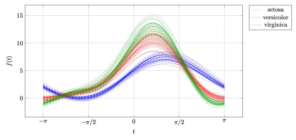
This is the result:
See also: Original Source by Stefan Kottwitz
Note: The copyright belongs to the blog author and the blog. For the license, please see the linked original source blog.
Leave a Reply
You must be logged in to post a comment.